React 19 dashboards
inside Node-RED.

fromcubes-portal-react is a Node-RED module that serves live React applications. You paste JSX straight into the node, it is compiled server-side with esbuild at deploy time, styled with Tailwind CSS 4, and wired to your flows over WebSocket — no build step, no runtime compilation in the browser.

npm version npm downloads per month node version Node-RED >= 4.0 license

⚛️ React 19 + JSX

Write plain JSX in the node editor. esbuild bundles React and your code into one file at deploy time.

🎨 Tailwind CSS 4

Utility classes are scanned server-side and served as static CSS. Autocompletion in the editor included.

🔌 Live WebSocket data

The useNodeRed() hook binds msg.payload to React state and sends events back to the flow.

🧩 Shared components

Define components once in fc-portal-component nodes and reuse them across every portal page.

📦 npm packages

Chart.js, D3, Three.js, PixiJS… declared per node, auto-installed and bundled at deploy.

🗂 Static assets

Built-in file manager sidebar serves models, textures and fonts at /fromcubes/public/.
1 Install

Install the package in Node-RED

Requires Node-RED ≥ 4 and Node.js ≥ 18.5. Two ways to install — pick one:

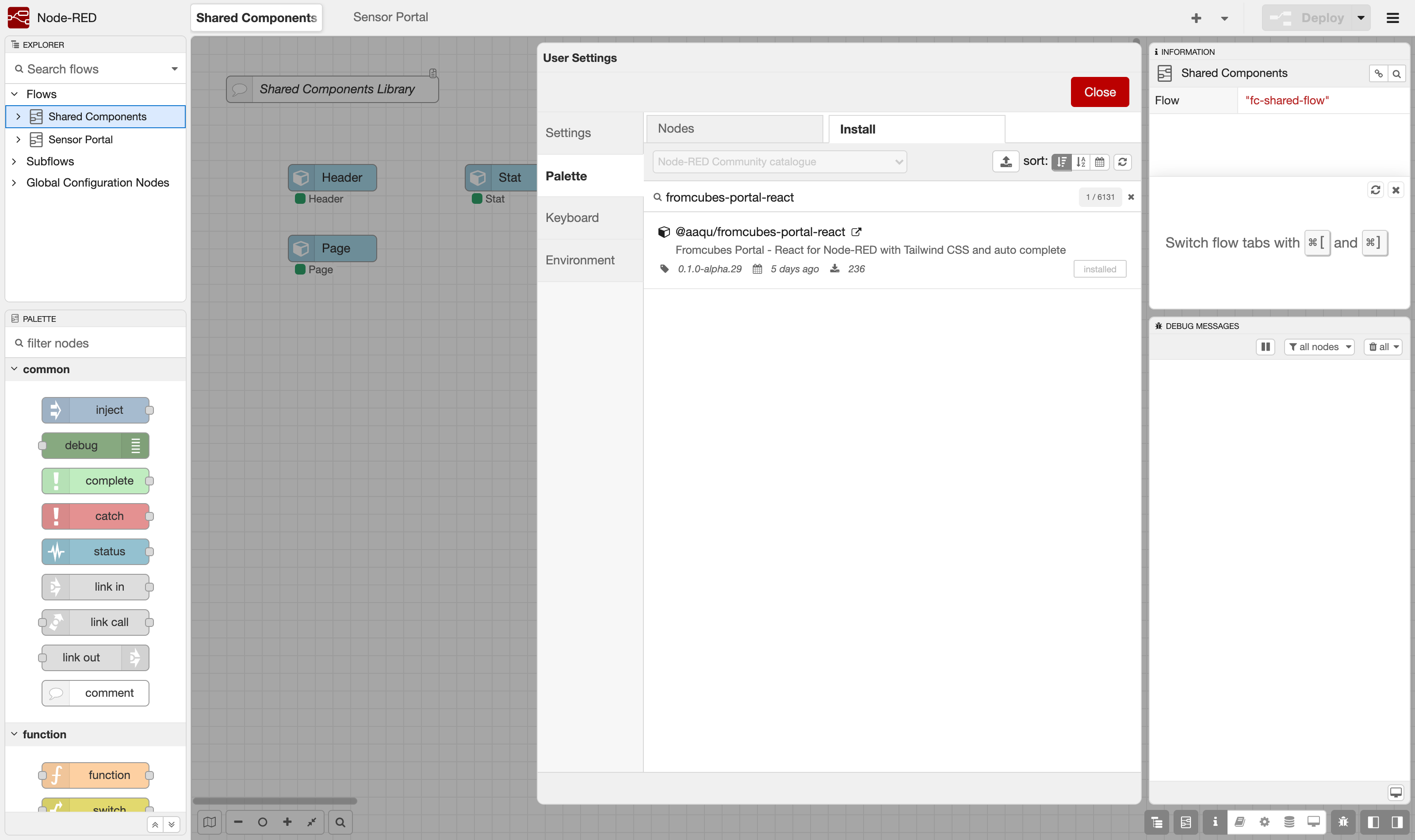
Option A — Palette Manager (no terminal needed). In the editor open Menu → Manage palette → Install, search for fromcubes-portal-react and click install:

Node-RED Manage palette Install tab with @aaqu/fromcubes-portal-react found in the catalogue
Manage palette → Install: the package is in the Node-RED community catalogue.

Option B — npm. Install into your Node-RED user directory (usually ~/.node-red) and restart Node-RED:

cd ~/.node-red
npm install @aaqu/fromcubes-portal-react
# restart Node-RED afterwards

Either way, three new nodes appear in the palette under the fromcubes category: portal react, react component and react utility.

2 Import

Import the example flows

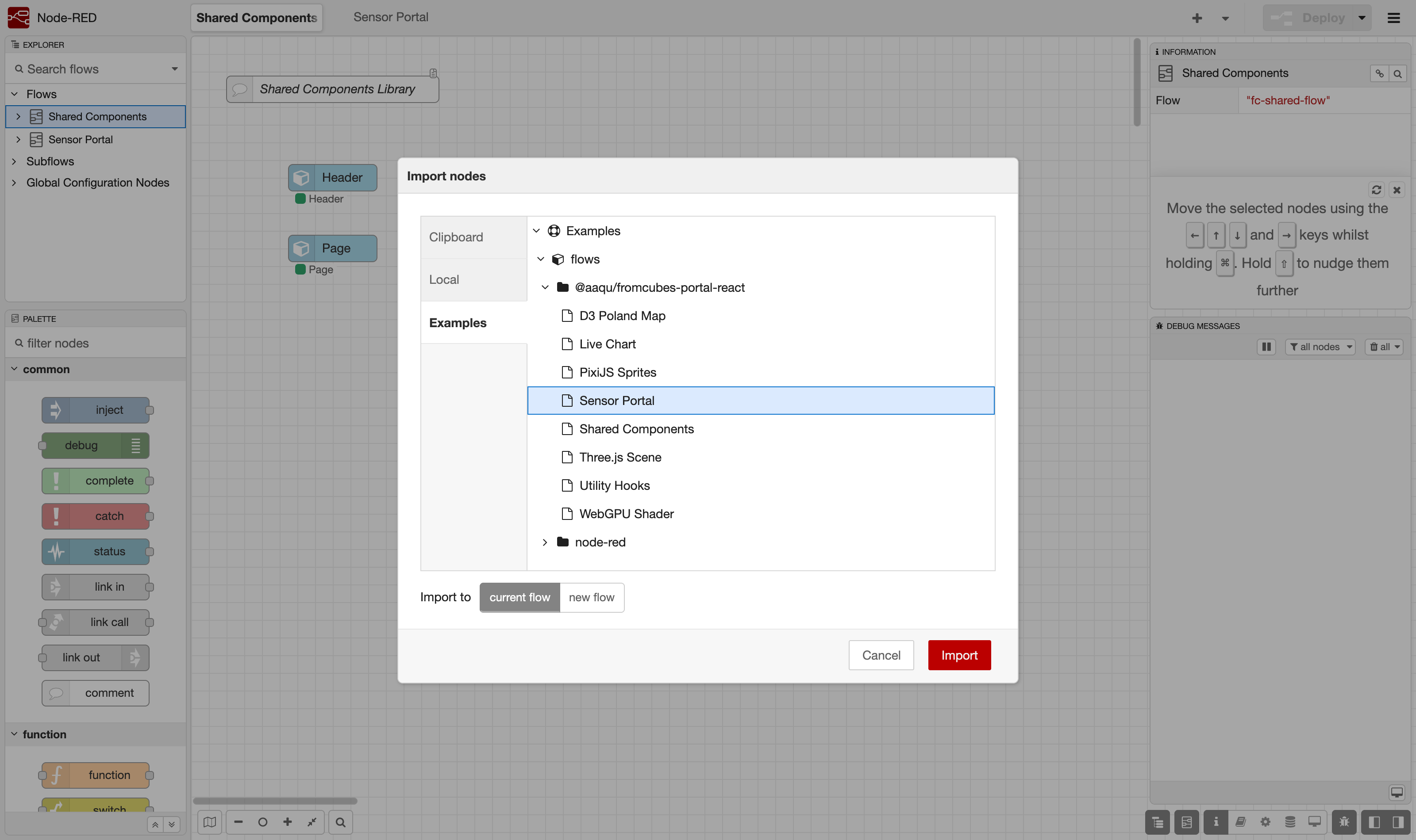
The package ships ready-made examples. In the editor open Menu → Import → Examples → @aaqu/fromcubes-portal-react. Import Shared Components first (it provides the reusable UI building blocks), then Sensor Portal — the example this guide follows end-to-end.

Node-RED Import dialog with the package examples listed, Sensor Portal selected
Import → Examples: pick Shared Components, then Sensor Portal.
3 The flow

Two flows, five reusable components, one portal

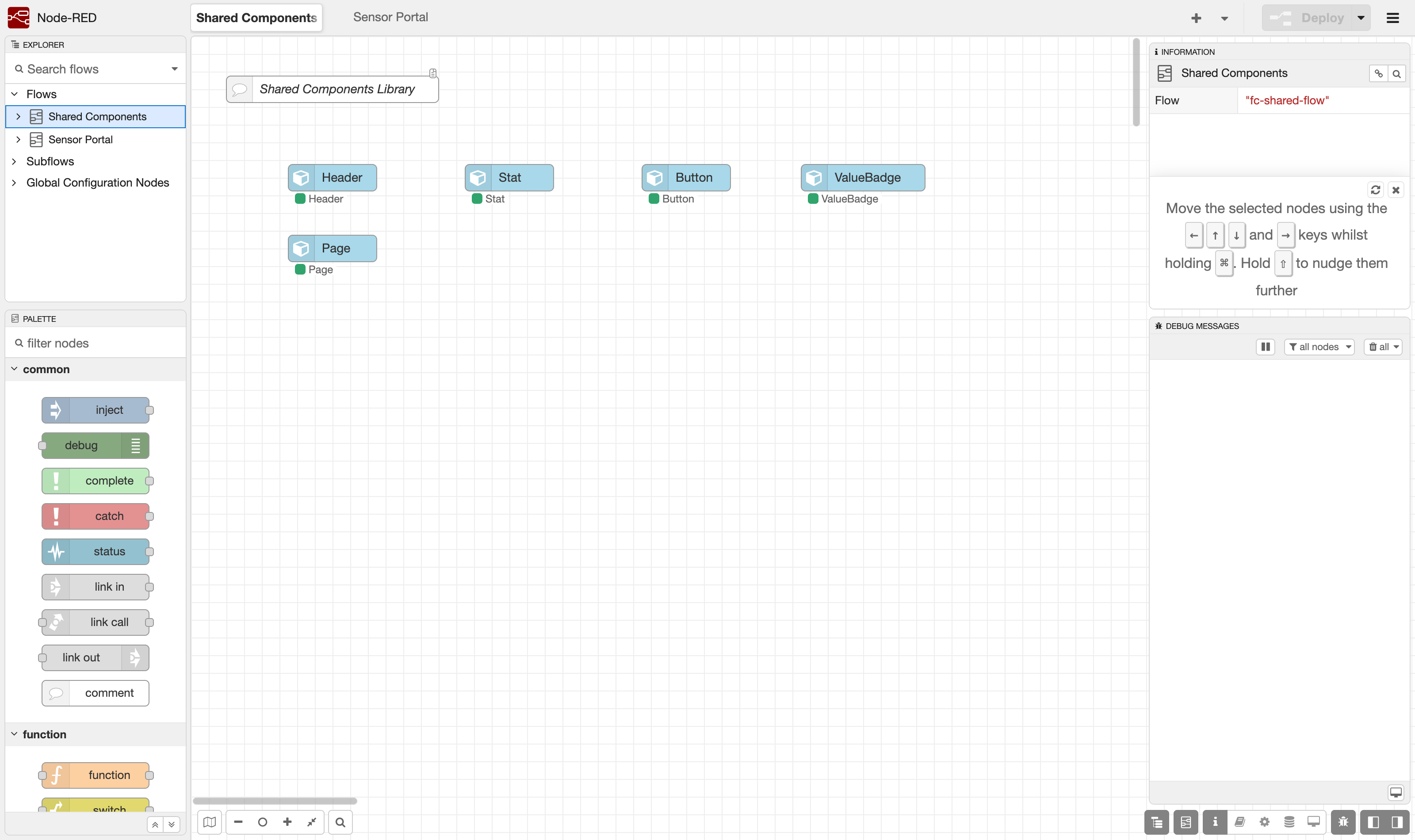
The Shared Components flow contains only fc-portal-component nodes — Page, Header, Stat, Button and ValueBadge. Each node holds one React component; once deployed, any portal page can use them as JSX tags.

Shared Components flow with five fc-portal-component nodes in the Node-RED workspace
The component library — plain canvas nodes, no wires needed.

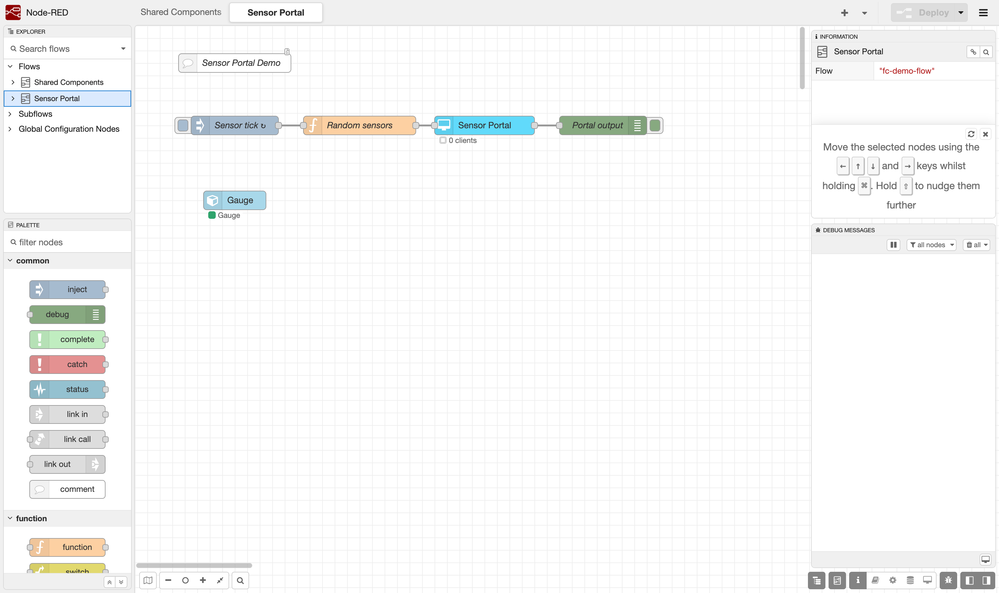
The Sensor Portal flow is the actual application: an inject node ticks every 2 seconds, a function node generates random sensor readings, and the portal-react node renders them. Anything wired out of the portal node comes from the browser (button clicks, form input).

Sensor Portal flow: inject, function, portal-react node and debug node wired together
inject → function → Sensor Portal (portal-react) → debug. The Gauge component sits beside the flow.
function · Random sensors
msg.payload = {
  temp: +(18 + Math.random() * 12).toFixed(1),
  humidity: Math.round(35 + Math.random() * 40),
  pressure: Math.round(995 + Math.random() * 35),
  ts: Date.now()
};
return msg;
4 React code

Paste React straight into the node

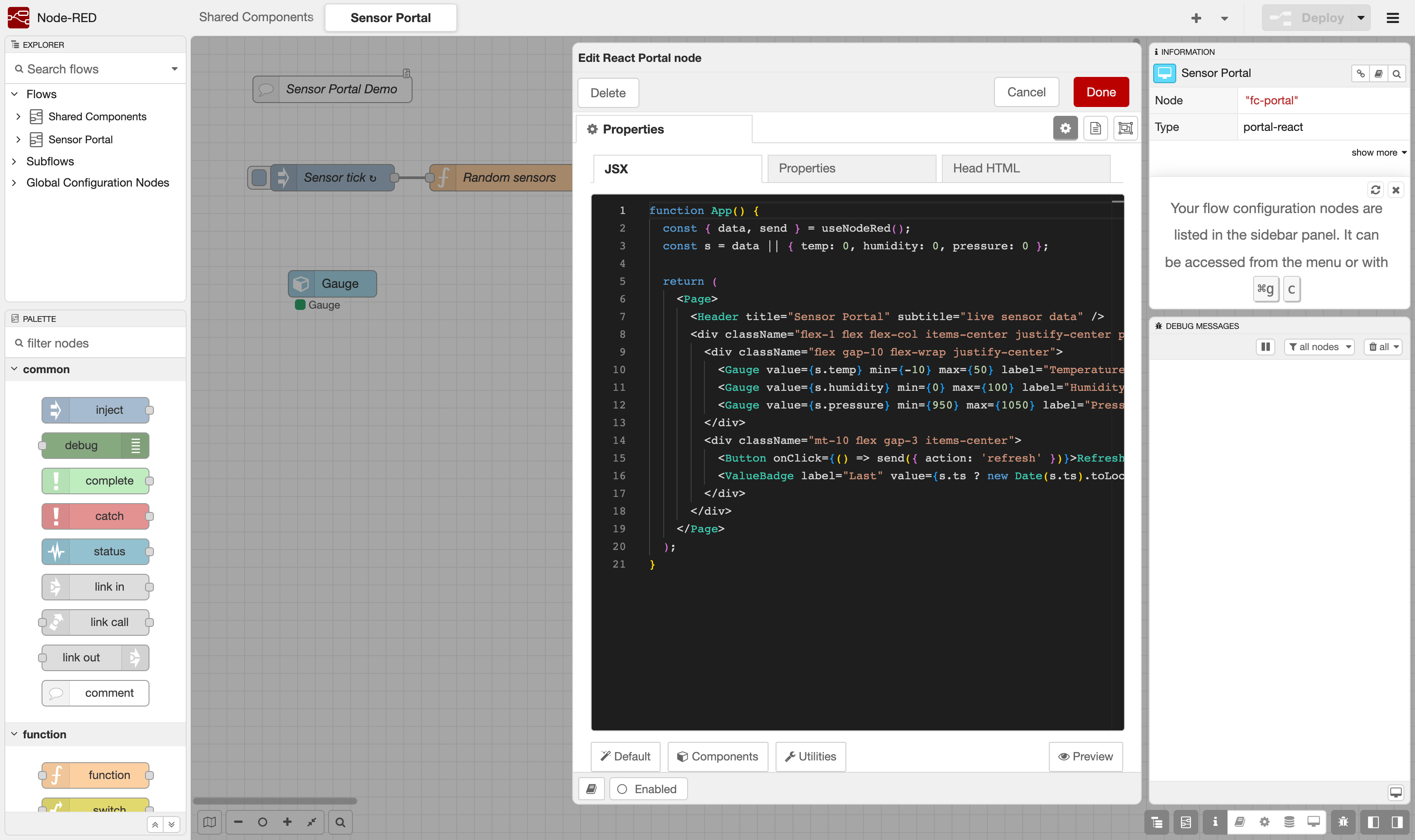
Double-click the Sensor Portal node. The JSX tab holds the page's App() component in a Monaco editor with JSX highlighting, Tailwind class completion and tag completion for your shared components. The URL sub-path field — set in the Properties tab next to it (here sensors) — decides where the page is served: /fromcubes/sensors.

portal-react node edit dialog with the App component JSX visible in the Monaco editor
The portal node editor — React code exactly as you write it, compiled at deploy.
portal-react · JSX tab
function App() {
  const { data, send } = useNodeRed();
  const s = data || { temp: 0, humidity: 0, pressure: 0 };

  return (
    <Page>
      <Header title="Sensor Portal" subtitle="live sensor data" />
      <div className="flex-1 flex flex-col items-center justify-center p-8">
        <div className="flex gap-10 flex-wrap justify-center">
          <Gauge value={s.temp} min={-10} max={50} label="Temperature" unit="°C" />
          <Gauge value={s.humidity} min={0} max={100} label="Humidity" unit="%" />
          <Gauge value={s.pressure} min={950} max={1050} label="Pressure" unit="hPa" />
        </div>
        <div className="mt-10 flex gap-3 items-center">
          <Button onClick={() => send({ action: 'refresh' })}>Refresh</Button>
          <ValueBadge label="Last" value={s.ts ? new Date(s.ts).toLocaleTimeString() : null} />
        </div>
      </div>
    </Page>
  );
}
Where do Page, Header, Gauge come from? They are fc-portal-component nodes. The bundler injects only the components your JSX actually references (plus their dependencies) — everything else is tree-shaken away.

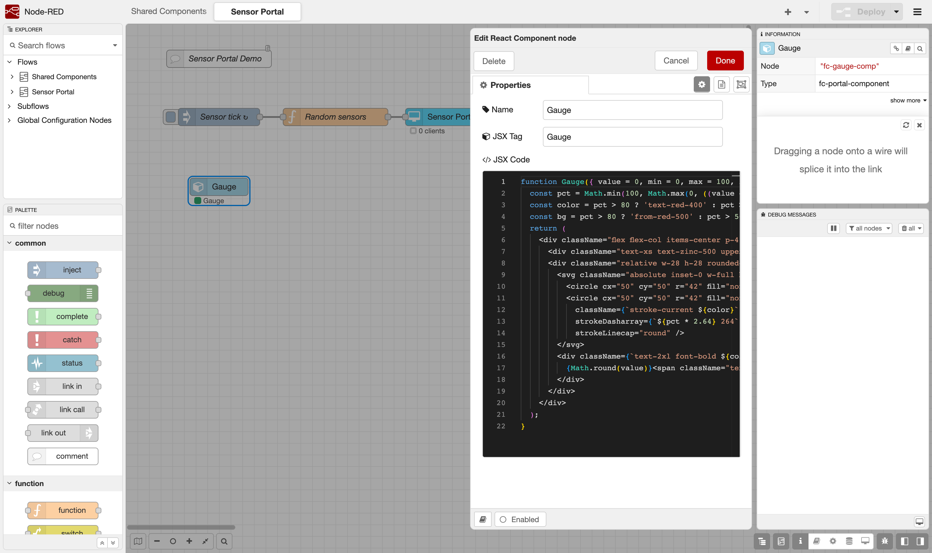
The Gauge used by this page is itself a component node living next to the flow — a plain React function component with Tailwind classes and an SVG arc:

fc-portal-component edit dialog showing the Gauge component source code
The react component node: Name + JSX Tag + code. One component per node.
5 Deploy

Deploy — the server does the rest

Hit Deploy. At that moment fromcubes-portal-react:

Build failed? The node shows a red status with the reason (syntax error, missing component…), and connected clients keep the last working page while an error banner explains what broke.
6 Result

Open the dashboard

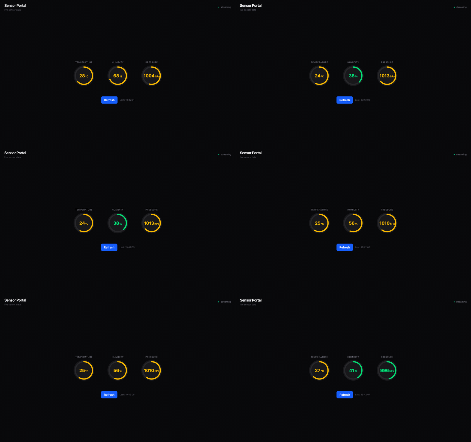
Navigate to http://<your-host>:1880/fromcubes/sensors. The gauges animate every two seconds as the inject node fires; every open tab stays in sync because broadcast messages reach all connected clients. Clicking Refresh emits a message on the portal node's output wire — check the debug sidebar.

Live Sensor Portal dashboard with three animated gauges: temperature, humidity, pressure
The finished portal at /fromcubes/sensors — live data updating every 2 s, zero client-side compilation.
7 Reference

The useNodeRed() hook

Every portal page gets one hook that is the whole runtime API:

const { data, send, user, portalClient } = useNodeRed();
FieldDescription
dataReactive value of the last msg.payload received on the node's input. Re-renders the component on every message.
send(payload, topic?)Emits a message on the portal node's output wire. The message carries msg._client so replies can target just this browser tab.
userPortal auth data forwarded by a reverse proxy (x-portal-user-* headers), or null.
portalClientUnique id of this session/tab, assigned by the server — useful for per-client state.
Targeting clients from the flow: reply with the incoming msg._client intact to answer one tab, strip portalClient to reach all tabs of one user, or omit msg._client entirely to broadcast.

Where to go next